A BIG HELLO to all of you!! *Waves!!* I've been unable to post for awhile and I've missed sharing nail art and thoughts with you! I actually got them done by last Saturday, and believe me I was very eager to show you guys. Unfortunately, my computer has gotten so ill that it will not boot up to Windows anymore. *sigh!* No matter what I did, even command prompt isn't helping. During times like this, I wish I had a big brother to help me out. So, for the past few days I've been using my sister's laptop and all her other gadgets to feed my online needs (mwah mwah! Love you, Sis!). But, the laptop's screen has this weird blue/purplish tint to it. And a little too bright though I've set the brightness 0. Which has caused me to not wanna post from the laptop. I did a little googling about the issues, looks like it isn't an uncommon thing. Though I still don't know the proper way to solve the issue, I decided to "colour correct" the screen by using the calibrate colours function. It's still not colour accurate though, but hopefully the nails turn out to be alright and all.. haha!!
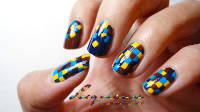
On with the nails, while I did have the thought of doing/attempting geometrical square nails the urge to do it was still subtle until I saw dear Julz Perri's nails in this post that I felt so inspired by the colour scheme, I just have to try one for myself!
Believe it or not, I used to dislike pairing my favourite colour Blue with my least favourite colour Yellow. (least favourite, I don't hate it) Lol! And I didn't get why people loved pairing my favourite with my least favourite always. Then, I learnt about colours and then complementary colours so on and so forth. Also thanks to the many treasuries curated by members of etsy as well as nature, my view was changed forever! I now, adore this combo! Hahaha!! But it took a lot of convincing (I'm stubborn by nature ;P).
I honestly thought squares were gonna be way faster than triangles. I was wrong. This time, I did almost nonstop and it took me about 8 hours just to get the thumb, ring finger and pinky done. I'm pretty sure I let out a sigh of relief when I was done with these three fingers as I knew I want the index and middle finger to have something different. Lol.
I thought of doing skittle so I painted the brown base for the index and blue base for the other. I paused quite awhile before deciding to just make them accents with dropping/falling squares.
So that's it. I do hope the colours turned out alright. It's still hard to judge from this screen. I hope you're enjoying this combination as much as I am now! :D They're still on my nails sooo reluctant to wash them off. I think I'd keep them for a week at least!
Nail polishes used:
- Tip Top Nail Chic - In the Navy!
- The Face Shop - BL602
- Peripera - OR406
- Revlon - Chocolate Truffle
- Nail art brush (modified to be medium length striper)


Awww, that's really cute! That must have taken you quite some time, hasn't it? :D
ReplyDeleteKinda reminds be a bit of black callas Tetris design on our blog (damn, now I really want to play my old videogames again. ;D)
Sure did! But it's alright since I'd only set out such task when I have plenty time at hand! ;) Haha! I'm telling you it's because they are squares! ;D Anddddd I know what you mean! They did remind me of tetris as well! How nostalgic!
DeleteOh my gosh, the moment I saw it I knew it took a lot of time but 8 hrs?! Cray.. Let me clap for you first *clap clap* :P
ReplyDeleteIt's amazing that you took the time to do this cause many would have use stampings for this kind of nailart.
I quite like yellow though I actually don't think that the combo yellow/blue is something special.. But the 2 different blue tones and the brown make this really work and I like it here a lot! ^.^
Haha thanks! Hmm, I kinda suspect I'm working way too slow perhaps? lol!! well, nail art is slightly easier than stamping is for me. If I had this pattern, say a picture that's suppose to stamp l_l would turn out to look /_/ LOL! totally crooked! hahaha!!
DeleteWell, the combo ain't some sort of special combo. But since they are opposite each other, in theory they kinda give a balance of contrast. I guess that's why you find them rather "harmonious" hehe! Glad you're joining in the likings! ;D
OMG!!! This is so pretty. Love the color combos and design. You def have the talent so keep creating more. Great job!
ReplyDelete:D Thank you, Marie! Glad to hear you love them as well! And thanks for the support and encouragement! Really appreciate it :D
Delete